Arch
443/646: Architecture and Film
Winter 2014
Renaissance
2054 (2006)
 |
Arch
443/646: Architecture and Film Renaissance
2054 (2006) |
 |
Discussion Questions:
Remember, your images are ABOVE your name.
Please answer the questions below. Use paragraph form. Submit to LEARN. THINGS TO KEEP IN MIND WHEN ANSWERING THESE QUESTIONS: I am looking for general observations about the film and the relationship to any aspect of f/x that we have examined. The images attached to your "words" are to clarify the intention but are not meant to be action specific. PLEASE TIE YOUR ANSWER TO ONE OR MORE OF THE OTHER FILMS THAT WE HAVE VIEWED SO FAR THIS TERM. i.e. how did Renaissance use your word or picture clue to create an effect and how did another film that we have studied this term do this is a similar way. |
x |
|||||
| 1. | 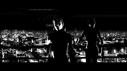 |
||||
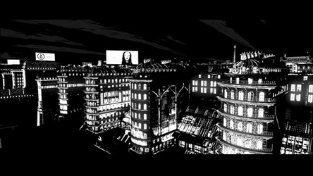
Hillary Chang In the film "Renaissance", the director used black as a way to create defining lines, forms and shapes without the use of colour or even many grey tones. The scenes with majority black were generally scenes showing a sinister act or a seedy situation; these usually involved Paris' underground society. The increased use of black signified a sense of suspicion and fear, influenced by film noir references and detective stories which use a similar effect. A film we watched earlier this term that used a similar effect was Alphaville; the scenes showing the protagonist wandering around Paris at night used very minimal lighting except sharp bright spots in the frame, highlighting a suspicious feeling as well as highlighting seemingly futuristic architecture and technology. |
|||||
| 2. |
 |
||||
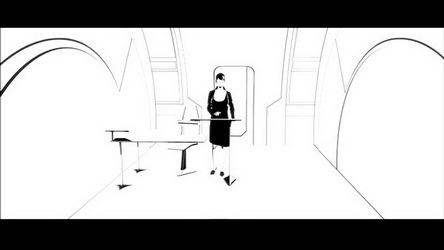
Patrick Cheung White was used in public spaces, institutions, and upper-class areas of the film. These places were predominantly white, the only instances of black were used to outline hard edges and separate people and vehicles from the scene. The intense use of white made these locations rather eerie and difficult to look at, giving the viewer a sense that something is wrong. White, a color that generally represents purity, felt like it was used to cover up the conspiracy and criminal underground that existed in Paris. A major example of this “cover-up” would be the Avalon facilities. The company would go to any means to exploit the secret behind eternal life, terrorizing and murdering major players in the field. However, the research facilities and labs are all blinding white, invoking a sense of normality and purity to the public while dispelling any notions the public may have of any criminal acts that the company may have conducted. Alphaville uses a similar technique of covering up conspiracy or evil with stark, pure facades. Almost all settings in Alphaville are a plain, flat grey, again dispelling any notion of evil the public may have. However, behind these pure settings is a society that wishes to turn it's human inhabitants into machine-like beings. |
|||||
| 3. | 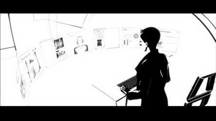 |
||||
Wesley Chu Being a science fiction film, technology is a driving force throughout Renaissance. However given its context, it is used very uniquely. Due to its animated nature, the movie could’ve potentially animated anything imaginable. The opportunity is present to create fantastical contraptions, impossible technologies and devices, and futuristic vehicles. Instead, the film is not seduced into the limitless possibilities, and actually portrays a very down-to-earth, realistic version of the future. As a sci-fi noir-styled detective mystery story taking place in 2054, there is an easy parallel that can be seen between this and the likes of Ridley Scott’s Blade Runner. However, taking place in 2021, Blade Runner’s technologies are far more advanced and fantastical than Renaissance’s. As we live now in the mid 2010’s, we would more closely relate to the world Renaissance paints for us, even though it is animated in black and white. There are only slight twists and adjustments on current technologies, rather than complete overhauls. Car phones now have video feeds, card IDs have spinning holograms, and weapons are “souped up” (they sound very different, but it is never explained what exactly the difference are, perhaps the method of propulsion is a different energy source from gunpowder? There is no bang, but a wooshing sound.) However everything in this universe is still used exactly the same way as we do today. Some of them are actually existing today, such as the video feed billboards (they have sound now). There is a heavy sense of discipline and restraint from the Volckman, as he is not tempted into the infinite depths of possibility when blending science fiction with animation. As far as architectural technology goes, there is an excess of a glass-like material. It is shown to span extremely long distances without structural support, while being traversable and impervious to gunfire. It is uncertain whether this is actual glass or a new material, as this use is currently physically impossible.
|
|||||
| 4. |  |
||||
Charlie Gao
|
|||||
| x | 5. |  |
x | ||
Maighdlyn Hadley
|
|||||
| 6. | 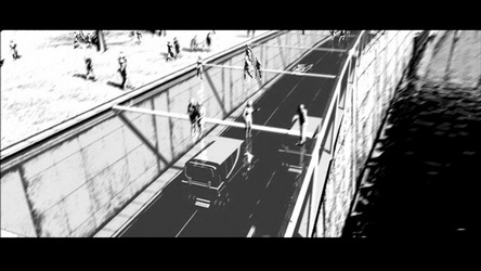 |
||||
Kyle Jensen In the movie “Renaissance 2054”, transparency can be seen throughout modern-day Paris. The use of glass as a key building component is interesting as it adds a layered complexity to the overall plan and architecture of the city. The transformations to Paris are emphasized as these transparent layers contrast the cityʼs historic layout with its new language of architecture, creating a believable juxtaposition between old and new. The black and white contrast technique used in the film uses glare on the glass surfaces, heightening the overall atmosphere by adding specific details denoting devisors of inhabitable space. Structural glass in this film creates a mystical and futuristic atmosphere in the spaces of todayʼs Paris. The Parkways for instance are a series of tunnels with transparent glass above, lighting the roadway but also creating car free pedestrian promenades above the road. This concept is especially interesting as multiple transportation methods including cars, trains and pedestrian travel converge in well lit covered solariums. I also enjoyed the modern modular glass boxes placed onto Parisʼs historical avenue structures to accommodate an increased population. The layering of habitable spaces creates an optimistic view for future city planning as well as future architectural expression. The architectural expression of the main office of the evil Avalon Corporation consists of an office space completely encased in glass - floor, ceiling and walls - which overlooks a public gathering space. These dramatic spaces seem to heighten the importance of the corporationʼs hold on the population as well as create a beautiful floating structure with views over all the surrounding area. Breathtaking views over the city scape can be made out with heavy contrasting elements through full glass walls, a true culmination of modernist expression. The aspect of transparency can also be seen through the life-like holograms projected both by the investigator of the involved parties to the case as well as in advertisements on the street. The idea of these life-like entities as a translucent representation is often seen in futuristic depictions as it can be used as a powerful tool for both advertising and role playing purposes. The false world in which the scientist is imprisoned is also interesting as it simulates a natural environment but does not allow the occupant to ever find the edges of the prison cell as space constantly reconfigures itself. These holograms mimic reality and create a new media for altering reality. A key feature that I really appreciated was how the language of modern architecture in the film was very much different from traditional forms found in the city. Light volumes and structures that seem to float are a real contrast to the older features of the city, consisting of oversized structural components similar to industrial revolution architecture. I almost feel like the glass and transparent portions of architecture lend themselves more to secrecy than the solid states of the historic structures, even though the former are completely see through. Valuable knowledge can be hidden far more easily in digital form than in tangible records that are hard copies, so the overall deviousness of the evil empire, even though on full display in terms of building material, doesnʼt reveal itself fully. Yet on another level, one can see that in fact some of the more sinister aspects of the plot are hidden in the ancient parts of the city consisting of the subway and sewer systems, while the modern world appears to be transparent. I feel like the contrasting architectural styles are felt more as the largely glass facades allow for a full range of views including older landmarks of the existing cityscape. These shots not only help to ground the film in a more real urban context but create a harsh contrast between architectural details that allow this futuristic civilization to seem credible. Research interests: Structural glass, basic technology and application: http://www.hkisc.org/proceedings/2006421/11_SLChan%20facade2006b.pdf Hologram Technology: existing projection methods- http://www.avconcepts.com/holographic-projection/ |
|||||
| 7. | 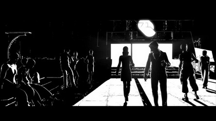 |
||||
Dan Kwak Illustration in an extreme contrast of black and white in Renaissance is often coupled with silhouettes of persons, objects and spaces. Silhouette masks details and leaves an abstract form of its subject. In Renaissance, this silhouette is often left with minimal details only to portray the powerful visualization of the subjects against the backgrounds. This effect successfully separates the subject in focus, i.e. the portrayed character, against the background that involves other objects and subjects. This seems especially crucial because of the possibly, difficult distinction between objects due to the high contrast, BW effect. Accentuation in the lighting and the shading, hence the making of a silhouette, becomes an important tool of filtering. For example, a scene portrays the silhouette of Karas walking against the massive, white screen of a woman promoting Avalon. It’s interesting to consider why the features of woman’s face are illustrated in details while Karas is seen as a black, moving object against her face. The audience is naturally focusing on the woman’s face and her words while the walking silhouette of Karas is seen as a lurking object. This clear distinction implies the subject of focus; in this case, the propaganda of Avalon and Karas’ position in relation to it. Another example is when Bislane is introduced in the dancing scene where every other person and object in the background is subdued to a mass of moving silhouettes while Bislane is getting all the attention in white. Bislane seems like the only person getting the spotlight in the scene, and this precise distinction separates Bislane from the crowd; to tell the audience, this is the character to be focused. The art of silhouette lies in hiding much complexity of the subject and dexterously portraying only the certain elements to illustrate the essence of the subject. This dark and eerie essence helps to create the mysterious mood of the narrative. Without the characters and the places having to explicitly state the mood, the relationship between the essence of the subject in focus and the relevant, juxtaposed object portrays is enough to illustrate the apparent mood in the narrative. Thus, this way of abstraction entails a greater complexity by “hiding”. A similar example can be found in The Woman in the Dunes, where a simple object is focused in light while the rest of the setting is shaded. For example, the shovel is shown in light against the pitch-black darkness of the outside. The film also elaborates on the technique of abstraction by the careful implication of lighting and shading. This balance of light and shadow and the use of silhouette are, therefore, especially important in Renaissance not only for clearly defining the focus on the subject, but to portray the moody essence through forming a delicate relationship between the subject and the object and further, to entail the hidden complexity of the atmosphere through the form of abstraction. |
|||||
| 8. | 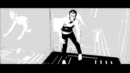 |
||||
Milos Mladenovic The role of reflections in the film speaks to both the content of the film as well as the graphic style which so strongly shapes the reading of the film. In the latter, I found that the reflections were foremost an appreciated opportunity to relax my eyes which became strained from the otherwise polarized black and white shades of the film. Although the reflections are only ever rendered in a single tone of gray, they provide a break in the continuity of the sharp contrasts in the film. Additionally, the gray tone quickly becomes associated with reflective surfaces - whenever it is present, the viewer understands that the surface is a transparent or somewhat reflective one. In addition to physically relaxing the eyes of the viewer and providing a sense of reference within certain shots, the reflections play a greater role in helping viewers identify the environments within the film. Much like Tati's Playtime, Paris (as we know it) is identified largely in Renaissance by means of reflections. The Eiffel tower and the "lower city" of infrastructural development around the river Seine are easily identified by their reflections in these transparent surfaces and help situate us within the different shots. This is an especially helpful effect since the black and white abstractions can often cause disorientation and a heightened level of abstraction with regards to different settings. In other cases, however, the filmmakers use this orienting effect of the reflections in the opposite manner, creating a sense of disorientation for the viewer within the scene by multiplying or refracting visual elements. In the image above, the protagonist seems to be fighting with three characters in an elevator as opposed to a single man due to the effect that the reflections create by multiplying the figure (the camera being positioned within his point of view does not help us gain control over our surroundings either). Thus, the gray-tone reflections are exploited at different times to play roles that can be quite contrasting and even contradictory. The simple mechanism adds yet another stylistic layer of effect to the film, abstracting it in some cases and bringing it back to reality at others.
|
|||||
9. |
 |
||||
Arturo Rivera
|
|||||
| 10. | 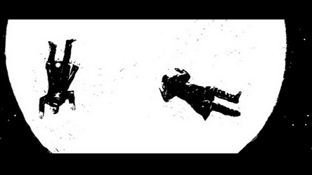 |
||||
Morgan O'Reilly In this futuristic Paris, a mega-corporation called Avalon is ever present and all powerful. The use of high angled shots contributes to this feeling by alluding to a watchful eye. This strategy is most obviously implemented when Brisbane sneaks into the Avalon data centre. Not only is the viewer shown that Brisbane is being monitored on many screens from a surveillance desk, but the shots that follow her are often taken from the high angle of the mounted surveillance cameras. This demonstration of surveillance using high angles is taken to another level during the car chase scene. The swerving fast paced chase is shown in a wide aerial view which then zooms in to follow the cars from directly above. This vantage point is an exciting and exclusive way to view this type of action. It also suggests eyes in the sky. In the police control room, the officers are shown watching the aerial view of the car chase on a large screen. The impression that the whole city is under a microscope is clearly conveyed. As a cinematic technique, the use of high angles makes characters appear vulnerable, stripping them of power, while low angles give dominance to characters and can make the viewer feel relatively small. This method of diminishment is also demonstrated in ‘Woman in the Dunes’. More than a cinematic strategy, this concept is engrained in the plot of the film, as the characters are held prisoner at the bottom of a pit and are viewed by their captors only from above. This is strongly exemplified when Junpei is provoked into attacking the woman as their captors egg him on from above. The majority of this scene is shot from the top of the pit. This makes Junpei and the woman seem like rats in a cage or flies scrambling for their lives in a toilet bowl. Looking down from above at the characters struggling with each other, robs them of any dignity they might have had left. In ‘Renaissance,’ high angles are also used as a way to display and glorify the layers and complexities of the futuristic metropolis in which the story takes place. Sailing over the city, the intensity and scale of the modern infrastructure is revealed in juxtaposition with elements of old Paris. The architecture of the Avalon Corporation is given specific attention in this way. After Karas interviews one of the CEO’s of Avalon about the missing researcher, the CEO is shown sitting at his desk viewing surveillance footage. The point of view then pans out to a full view of the colossal building, in which the office is located, towering over Paris in the background. It is revealed that the completely glass office in which he sits, floats high above an immense public square suspended in the middle of the arch-form of the building. The enormity of the architecture and the prestigious location of the office could only be appreciated from a high angle, which puts great emphasis on the terrifying power that Avalon wields. The graphic style of the animation of ‘Renaissance’ must also be considered in the discussion of the high angles in the film. The composition of shots that look directly down at the subject is especially striking as the image becomes flattened. The depth that results from oblique camera angles is often taken away by this unusual perpendicular point of view in an animated film. This effect lends itself well to the high contrast black and white style of the film. Without the creation of depth that is required in most scenes, there is no need for anything in between pure black and pure white. This is exemplified in the still featured above, in which Karas lies injured next to the dead Muller. The men’s silhouettes are starkly set against a white spotlight. The resulting image is simple, but powerful.
Bibliography Holden, Stephen. “Even in a Place Like Paris, It’s Not Good to Live Forever.” New York Times, September, 2006. Isaac. Renaissance: Paris 2054 (2006). http://shutupandwatchthemovie.wordpress.com/2010/07/01/renaissance-paris-2054-2006/ IMDB. Renaissance (2006). http://www.imdb.com/title/tt0386741/ Wikipedia. Renaissance (film). http://en.wikipedia.org/wiki/Renaissance_(film)
|
|||||
| 11. | 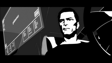 |
||||
Patrick Rossiter The low angle shot was used quite often in this film and with great effect. As used typically to describe the hero or saviour archetype, this angle reinforces the idea of Karas being the one with pure intent to solve the problems and mysteries of the storyline. This camera angle reinforces his status as the man in charge and a physical presence. This allows the viewer to identify that his character is at the center of the story and any important event will unfold around him and his actions. The low angle shot was used quite regularly in the film “Brazil”. This was a Gilliam staple – he shot films with great use of wide angle shots. Some of the widest angle lenses used in film became known as “Gilliam Lenses”. The use of these wide angle shots allowed the film to describe in greater detail the surrounding scenery and how the characters were placed within them. The low angle shot also added greater comedic value to the imagery of characters as it distorted their features creating a cartoon like effect. Within “Renaissance” I believe that the low angle shot offered two great capabilities to carry the storyline further. 1 – It allowed for the environment of the character to be described in greater detail. As the story was based in the year 2054, the environment and technology had to be futuristic. The technology as seen in the vehicle Karas was driving brings the viewer to this future ideal. The holographic floating screen within the cockpit of the vehicle is placed where it would be easiest to access while driving. Placing it around the level of the hands, the low angle shot allows the viewer to experience what is intended to be a glimpse of a potential future. 2- It allowed the break through animation techniques to shine as facial expressions were one of the most difficult aspects of the technology to capture – this angle brings the viewer so close that it has to be believable and true to human nature. As this type of animation was in its early days in 1998, the gamble of making the characters be as fluid and realistic as possible was an essential risk to take if the film was to be well received by the public at large. The producers used motion capture and computer graphics to create the film's unique look - The cast performed their scenes in motion-capture suits in front of a blue screen - Computer animators translated these animations to digital models used for the characters - The animated characters were placed in three-dimensional computer backdrops, with post-process effects added to achieve the film's final look.i As this was the case, the body movements of the characters was left to motion capture and correcting it appropriately in post work. The facial expressions were constructed using computer animation and therefore needed great attention to detail. There were facial references made which basically had the actors read their lines while being recorded, then the animators used them to create the series of movements on the characters face from scratch. Regarding this challenge the producers said “We started from a very comprehensive reference and method and translated into a system of about 100 shapes with complex rules of interaction.”ii This research and development process led to great results which created lifelike eye movements and facial expressions. At no moment did the facial expressions strike me as inadequate or confused – so I consider it a great success that the low angle shot could be used freely without reservation.
i “Renaissance,” last modified March 27th, 2014, http://en.wikipedia.org/wiki/Renaissance_(film). ii “Renaissance Film Noir Animation: Mo-Cap Techniques Lend a Touch of Realism to Dark Fantasy World,” last modified September 20th, 2006, http://www.studiodaily.com/2006/09/renaissance-film-noir-animation/.
|
|||||
| 12. | 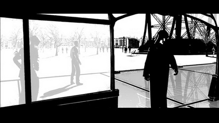 |
||||
Simone Tchonova Since the entire film uses a special digital feature each layer of the movie is digitally speaking a separate physical layer that can be manipulated at the simple touch of a button. One of the layering effects provided is the layering of graphic lines and text over the film which portray the film as viewing a monitor or a futuristically augmented version of reality or something coming from google glasses. In essence this effect supports the futuristic plot of the movie. The film’s effects also have a comic story style to them with the use of graphic symbols it is easy to make the connection to a comic book where a character may have a speech bubble saying “POW” right next to them. There is also the layering of transparencies in architectural elements the huge glass penthouses or the skylight/walkways surrounding the landscape around the NotreDame Cathedral. The differentiating layers of infrastructure, architecture, and landscape of future Paris is exemplified through the use of layering drawings to create a rich context full of varying 3Dimensionality within the urban fabric. Since the directors chose to design a film purely of black and white colour they were even more subdued to use the effect of layering through transparencies and varying gradients to create differentiation between depths of the surroundings. For example we know that the black figure in the image above is in the same space as us(the viewers) in contrast to the two grey figures on the left that are in a different space separated by a translucent wall. Another use of layering and transparencies of black over white is the bridge in the same image which has a structure of trusses that slowly dissolves into the background as each truss that is further in depth becomes a lighter shade of grey. In essence this is a drawing/painting technique. If I were to compare the effect of layering in Renaissance to the effect of layering as an artistic form in Science of Sleep then it is safe to say that they both use layering in different ways. This is due to the medium each respective director has chosen to portray artistic layering in digital, computer graphics and craft materials. As Renaissance uses gradients, The Science of Sleep manipulates material properties and uses materials differing in texture to give quality to dream sequences. |
|||||
| 13. |  |
||||
Yiming Wang
|
|||||
| 14. | 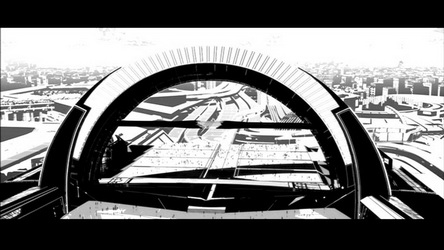 |
||||
Victor Zagabe The future as represented in Renaissance is a representation of the kind of future that could be compared to that of the Jetsons or Futurama. It is a kind of future that not only depicts a society similar to that of 1984, where all movement is easily tracked and watched, but also speaks to the way in which the architecture of a city may help to facilitate certain cultural ideas such as that of transparency, control, and deception. The future is filled with various digital projections that find themselves on the streets, in the sub terranean transit system, and just about anywhere you can think. The idea of these projections is embedded within the architectural fabric of the city buildings. Rooms are left as blank canvas for projections to create an alternate reality. The fact that these projections no longer reqire a need for a physical object to land on, means that the idea of the boundaries of illusies have been blurred. You can see this when the holograms of women seemingly float in mid air, without being projected onto a particular surface. In this future, large spans of glass were created to allow for a certain drastic sense of transparency between the world above and below. People are even able to walk over top of the expressway on glass pathways, allowing for a continuous visual perception of space. The idea of being able to monitor everything continues in this sense. Another interesting thing about this future is the way that defence mechanisms are employed in the buildings themselves. The floors at one point, revealed a sharp and jagged saw-like surface, which helped to throw off one of the cars in the chase scene. Thus this idea of monitoring is taken to the extreme in the sense that one is able to activate such mechanisms with ease in times of danger. |
|||||
updated 25-Apr-2014 5:46 PM